How CO₂ moves underground: Visualizing flow simulations
- Department Statistical analysis of natural resource data
- Fields involved Geomodelling
- Industries involved Natural resources
CO2 is stored deep underground, one key question matters more than anything else: will it stay there? To answer this, researchers run advanced computer simulations that show how CO2 moves through geological formations over time.
We have developed tools that make these simulation results much easier to explore and understand. They help answer important questions such as:
- Where does the CO2 move?
- Is there any risk of leakage?
- How much CO2 can be safely stored?
From raw simulation data to clear insight
Even a single flow simulation produces huge amounts of data. In real projects, researchers typically run many simulations – maybe hundred or more – using slightly different assumptions to test uncertainty and sensitivity.
This creates an ensemble of possible outcomes.
Our tools make it possible to:
- Explore one simulation in detail
- Summarize many simulations by calculating statistics over the entire ensemble
- Easily highlight and analyze simulations that require closer inspection
Instead of working directly with complex 3D data and long tables, users get clear maps, plots, and statistics that show how the CO₂ plume develops over time.
The tools process results from reservoir flow simulators, primarily Eclipse and Cirrus, and are designed to work seamlessly with Equinor’s Fast Model Update (FMU) framework.
They consist of two parts:
- General post-processing scripts based on flow simulation results.
- Dedicated visualization plugin called CO2 Migration, implemented in the web-based, open-source visualization framework Webviz.
CO2 storage scenarios
The tools support these two common scenarios for storing CO2 underground:
- Saline aquifers, where the underground formations are filled with brine (salty water)
- Depleted fields, with remaining hydrocarbon gas and/or oil present. These typically have existing extensive data from oil/gas operations, and with proven containment properties.
Core features
The post-processing scripts are designed to:
- Aggregate 3D grid data into maps for relevant grid properties, such as CO2 gas saturation, fraction dissolved in brine and CO2 mass.
- Calculate migration time maps, showing the time it takes CO2 to migrate to the different parts of the grid.
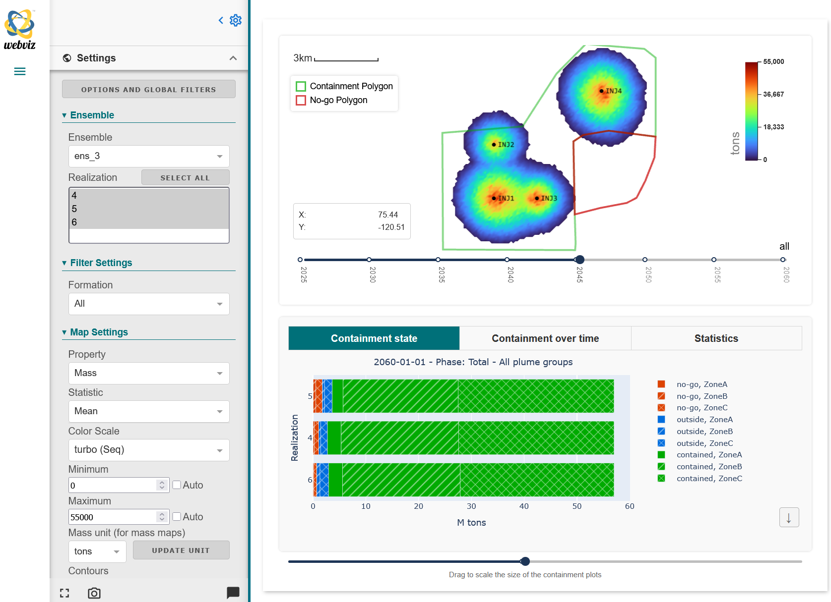
- Calculate mass or volume of CO2 at each time step, classifying results based on the following categories:
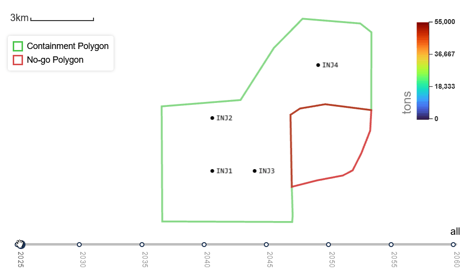
- Containment areas: For which realizations can we observe leakage into the “No-go” area?
- User-defined regions in the 3D grid model – similar to containment areas but more general. Do any of the realizations have CO2 migrating into region X?
- Grid properties (gas saturation, dissolved fraction, etc) and CO2 mass phases (free/mobile gas, residual trapping, dissolved in water).
- Geological zones.
- Track separate plumes from multiple injection wells.
These results can be visualized in the CO2 Migration plugin:
- Plot aggregation and migration time maps. Either for single realization, or produce plots of ensemble statistics over multiple/all realizations.
- Various other plots, splitting or filtering results based on the categories described above:
- Time series plot of CO2 mass or volume. For instance, how the total mass is split into the different phases (dissolved in water, free gas, residual trapping) as a function of time.
- Summary of CO2 distribution for a single time step. For instance, sort realizations on by how much CO2 is in the No-go area at the end of the simulations.
- Box plot.
- Cumulative probability plot.
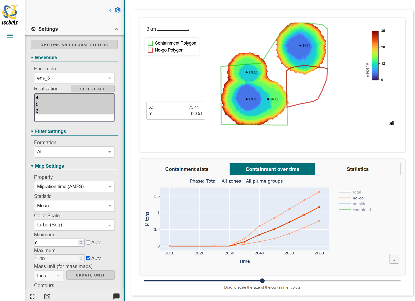
The 2D map shows the average migration time in number of years for each grid node. The plot at the bottom shows the total mass of CO2 in the “No-go” area, marked by the red polygon in the plot above, as a function of time. Figure: NR.
To learn more about our work in this project, please contact:

Project: FMU for CCS
Partner: Equinor
Funding: Equinor
Period: 2021 –
Where to find
- The post-processing scripts can be found in Equinor’s open ccs-scripts repository.
- The CO2 Migration plugin is part of the Webviz framework, see the GitHub repository.